Charles Bukowski Poster

Charles Bukowski poster

Now I´ve published about three soccer posters on the site (and there are still seven to go), I thought it would be time for a change. So, before everybody thinks I´m only making soccer posters at school, I´ll show a poster from a different course: typography.
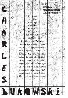
The assignment was to make a poster using only one typeface that's in the style of Charles Bukowski. He's a sarcastic, dark writer who was addicted to alcohol all of his life. That's why I put the mandatory extract from his book in the shape of a bottle. Furthermore, I rotated a piece of badly scanned in writing paper to give the suggestion of prison bars. Because he was like a prisoner of his own addiction.
I am particulary proud of this poster because: 1. I like the writer Charles Bukowski 2. Despite the restrictions I managed to put an idea in the poster. For the lesson of typography I have to make nine posters on A3 format, black and white, every week. It's a hell of a job. But whenever you make so many posters, there are always one or two posters that you're completely satisfied with. Yesterday I finished the new nine posters within four and a half hours. They certainly learn you how to work fast here.


2 Comments:
hey robin,
ziet er goed uit man.. toppie woppie ga zo door..
Mensen pas op Robin Stam is ontdekt :)
kus neppie
welnee ...lieg niet .... hihi
hey man dat is jouw teken stijl ...netjes hoor
Post a Comment
<< Home